Ok. You’ve got your smart new brandmark (taking Tony’s advice) and you’ve done all the right things including getting underway with IP protection and developing your style guide.
Now, like a proud parent, you can’t wait to get it out there and show it off.
And this is where not taking the last few steps can end up costing you big time in the way your stakeholders experience your brand.
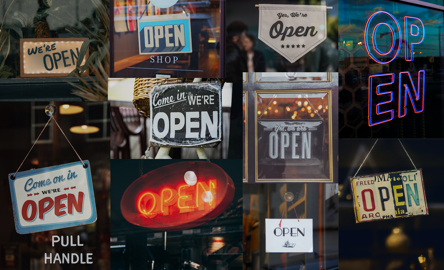
What are those steps? They can change from sector to sector, but essentially it comes down to the detail. The way your market sees you beyond just your social post or your pre-roll or your website.
In most cases, it can be the boring stuff like way-finding, product packaging, vehicle livery, mailing packs, email signatures, EDM’s, customer p2p engagement, etc., etc. It’s not just a case of applying your style guide. This is lazy and because the budget has all been spent at the front end of the branding process, cheap.
It’s the bits and pieces like the list above that really sort out the brand masters from the wannabees.
You see, these guys understand that their customers don’t operate in a vacuum and aren’t going to be excited by your style guide. They understand that “branding” has many more layers than just the proper application of the logo. They understand that every customer interaction is an opportunity to keep you in their sandpit and not to be disappointed by the “little things” they encounter. In fact, this small stuff is where you can grow your brand far more deeply than the big-ticket advertising items.
Here are some examples:
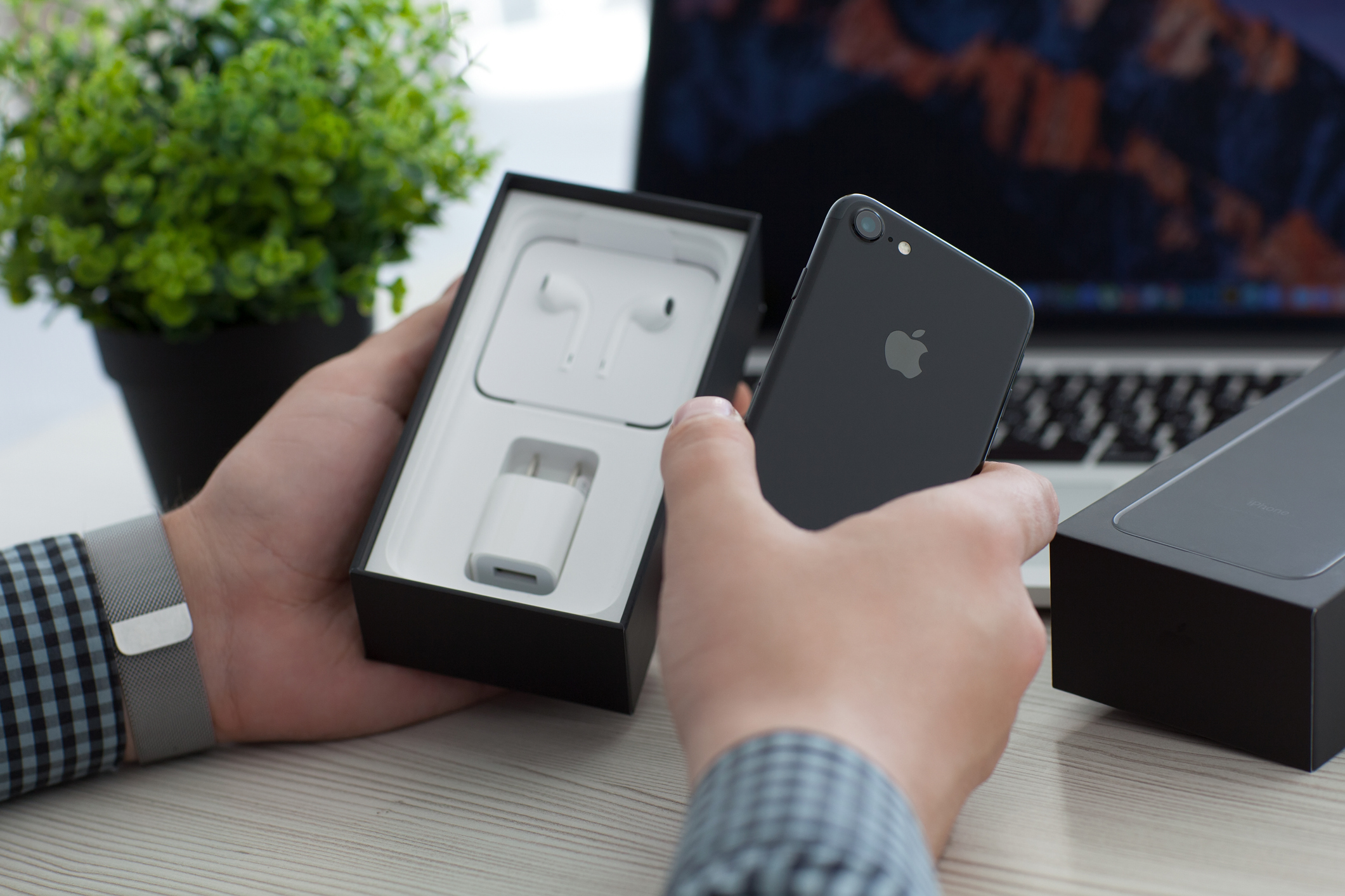
#1 Apple
Of course, it’s No1.
First up. I have to admit something here. The only Apple product I use is a keyboard. A long time ago I opted to not get into their ecosystem and instead I’m in the Android world. This doesn’t mean that I can’t flat-out admire the sheer brilliance of their attention to detail. Apple has, for some time, convinced the world that if you use their products, you are going to feel more “creative” or “clever”.
And, boy, when you get that box it sure delivers on that emotion.
They decided that their products should be beautiful inside and out. They set out to create something as sleek, minimal, and attractive as their computers and devices. In other words, making these elements speak for the brand more than just the brandmark. Apple engineers and designers spend months and months just opening and closing boxes, testing different materials to create that signature “unboxing” experience. Even their shipping containers are treated with the same care. Personally, I love the fact that they don’t use bubble wrap or other void fillers.
If you are an Apple devotee, I bet you that you hung onto some of those boxes and didn’t toss them out. Recently some of their competitors have followed their lead and copied their packaging concepts.
What more can you say?
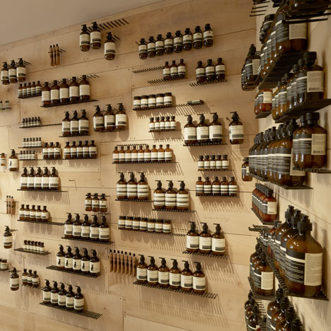
#2 Aesop
Source: Dezeen | Aesop, Tiquetonne by Cigue
From a product that I don’t use, to one I do – Aesop. This is a product, where the product is the brand.
Now, that sounds a bit convoluted, so stay with me here.
In the modern consumer world, there is a truckload of products out there where the brand (and everything around it) has to be more important than what is in the bottle, or tube or box. Why? Because basically what is in that container is pretty similar to its competitors. The only difference is price, or distribution, or audience segment. The brand it’s wrapped up in has to become the differentiator. Investment behind the product is probably heavily skewed towards marketing and less so in ingredients.
The genesis of Aesop was different. Dennis Paphitis started developing the brand while operating a hair salon just off High Street Armadale in 1987. He was frustrated with commercial beauty products which used manufactured colouring and fragrance. Natural botanical ingredients became his solution. And to this day it is still where most of the development dollars go.
Blindfolded, you could tell by feel an Aesop product from any competitor. That brown packaging and those bottles are now imitated across the spectrum (It keeps the light out from the botanicals).
And for that, you do need to keep your eyes open. Aesop’s product is the individualistic store designs, the in-store messaging, the instructions for use, and the way in which the floor team engages with you. Right down to walking you to the door and handing you your purchase as you leave.
This is a retail chain with soul. No cookie cutters here across 300 stores in 20 countries.
Source: Dezen | Aesop ION store in Singapore features Snøhetta-designed “upside-down forest”
This quote from Co-Founder Suzanne Santos is telling:
“We invite the individual to become involved. It beckons you to be part of it. Companies generally try to force their own culture onto you, but we’d rather invite you to immerse yourself in it. We make products for customers, not for ourselves. We make it for other people’s pleasure”
At Aesop, all the details are beautifully crafted and curated.
Now, that’s what I call “branding”.
Get in touch if you’d like to discuss your brand’s “smaller details”. Contact us